Same information.
Completely different impression.
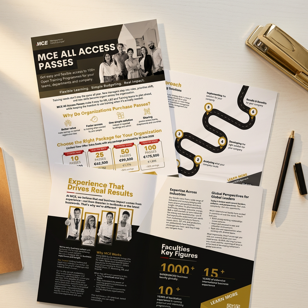
Three real transformations, each starting from the kind of ordinary business content most firms already have in a folder. Nothing was added and nothing was invented. Only the structure changed, and that's what changed how it reads.
01
Before
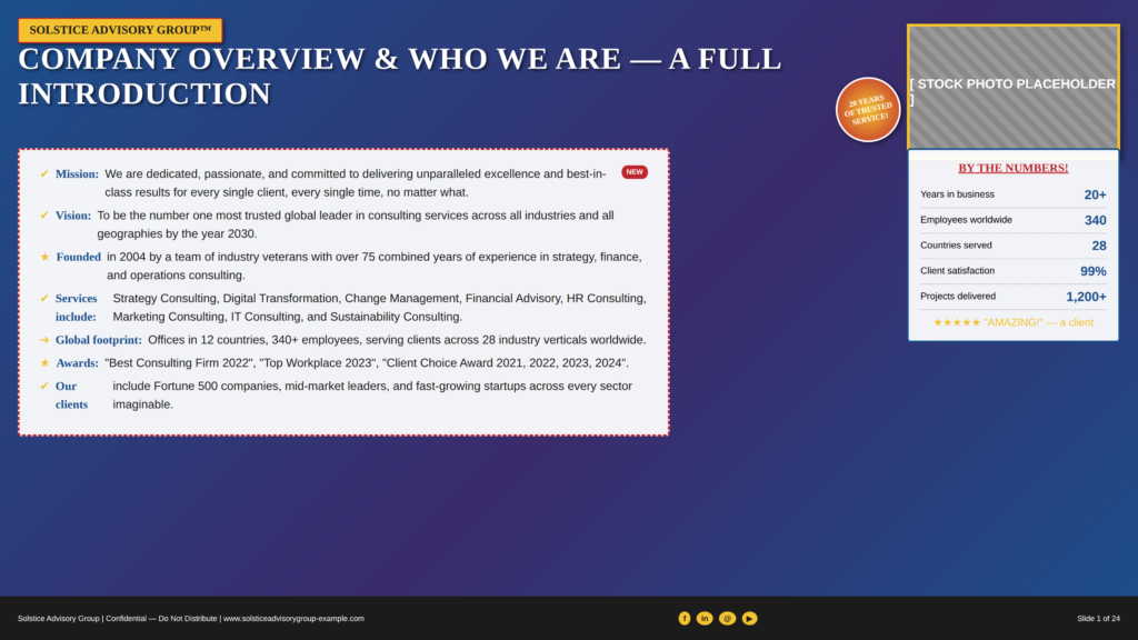
Everything competes for attention: bullet points, a stock photo, a seal, a sidebar. Nothing leads.
After
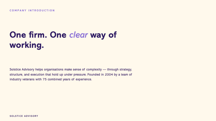
One idea, stated once, in the right order. The room reads it in the time it's on screen.
02
Before
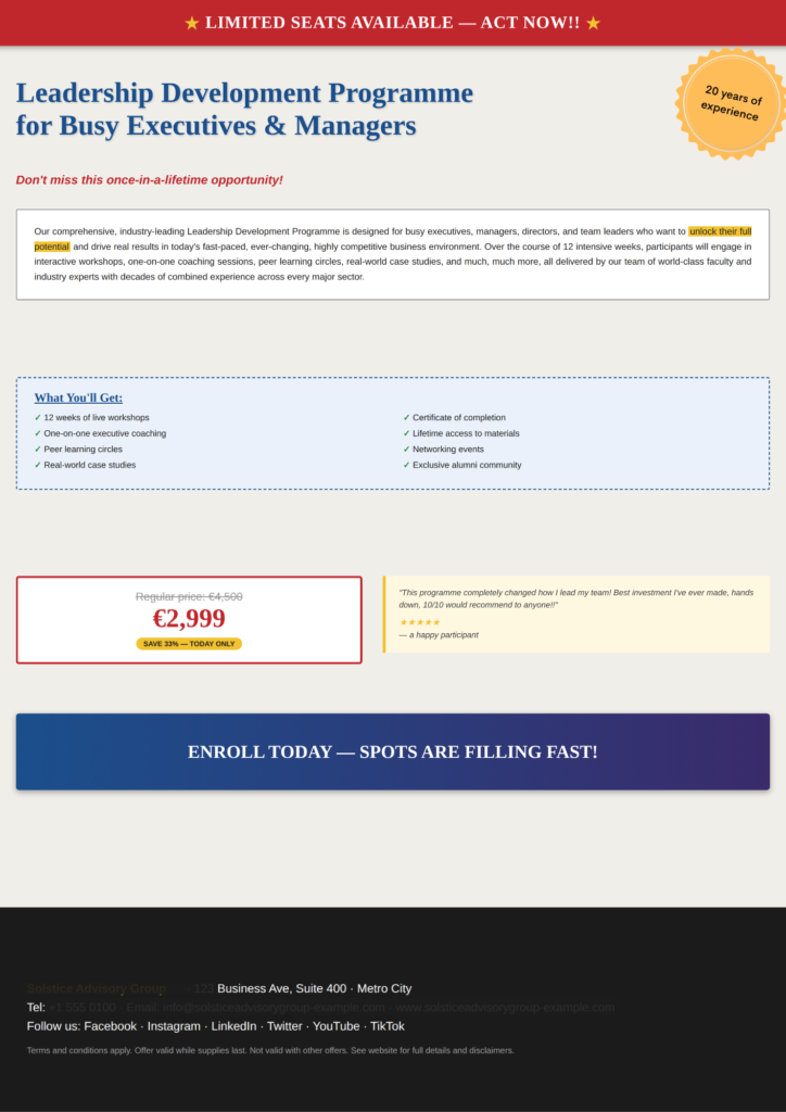
Urgency dressed up as design: banners, badges and a price box shouting over the actual offer.
After
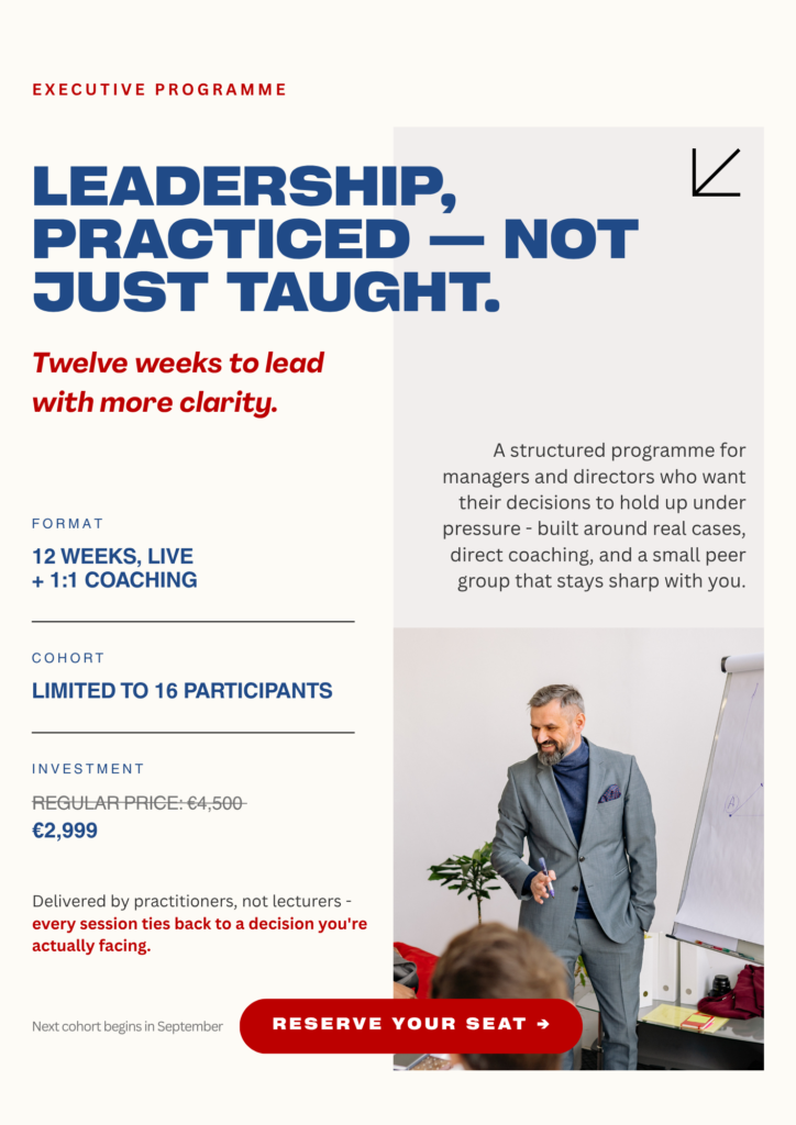
The offer, stated plainly, once, with enough space around it to actually be read.
03
Before
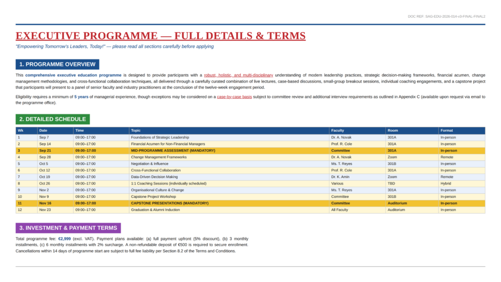
A document built to be searched, not read: four colours of section header and one dense table.
After
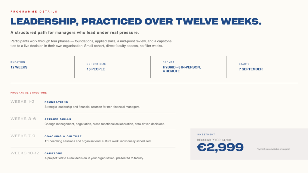
The same facts, organised so a decision-maker understands the offer in a single pass.
What actually changed
01
Size, weight and colour decide what's noticed first, on purpose rather than by accident of what fit on the page.
02
One message per surface. Anything not essential to it is removed, not just made smaller.
03
Space isn't what's left over. It separates one idea from the next, so the reader never has to guess.
04
The same palette, type and structure across every document, so each one reinforces the firm behind it.
How we get there
01
A clear look at your current materials: what they communicate versus what they're meant to.
02
Deciding what leads, what supports and what gets cut, before a single visual choice is made.
03
Palette, type and structure defined once, so every future document stays consistent without a redo.
04
Decks, flyers, programme materials and your website, rebuilt on the same foundation.
Your materials next?
On a 20-minute call we'll look at what your materials say today, and what they should be saying.